Editor's Note: It's a well-known tradition in PKU for each of the Colleges to design their own T-shirts and merchandise. Recently, a group of PKU students showed off the T-shirts of their own colleges and school and explored the concept behind the design.
Check out the video to see their school pride and scroll down for a PKU College T-shirt Showdown!
Find any design appealing? Ever wondered the meaning behind every design? Let's dive right in and understand more about these shirts!
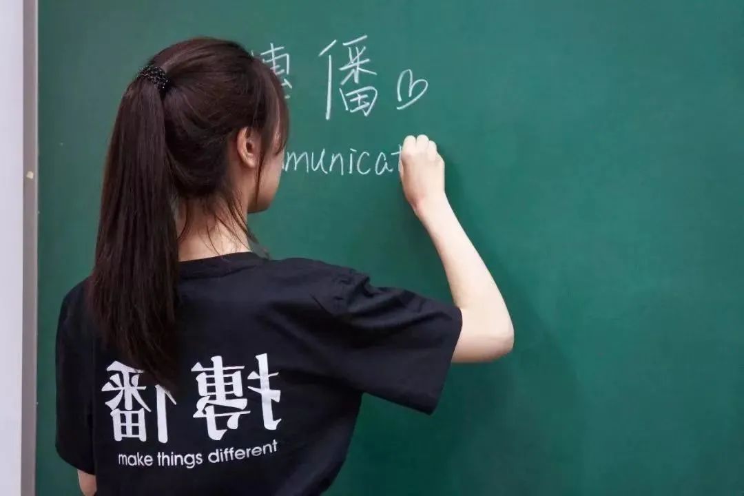
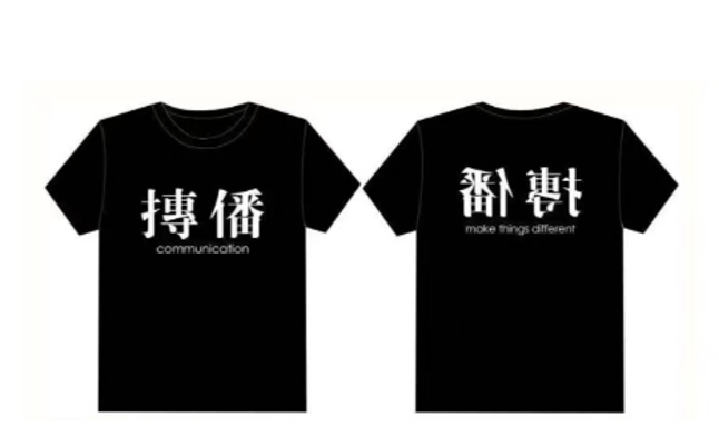
1 School of Journalism and Communication
The front of the shirt has two huge Chinese characters printed on it. At first glance, it looks as if there are two correctly written Chinese words, "Chuan Bo" (传播), which translates to "communication". Yet, if you were to take a closer look, the radicals of both Chinese characters are swapped.
There are two interpretations to this. First, just like when bringing across an important message, the order of information in the message does not really matter. Similarly, the two words, even though their radicals have swapped places, most people can still decipher what the two characters mean.
Another explanation for this is that, changing how news or information is reported may impact people’s perception differently. Likewise, with the two radicals changing their positions, different people may have different understandings or opinions. How thoughtful and interesting!
As for the back of the shirt, the two Chinese characters are printed backwards, with a slogan "make things different" right beneath it, reflecting the individuality of students.
2 Yuanpei College
This red T-shirt, which aligns with the official PKU school colour, was designed in celebration of the 20th anniversary since the establishment of Yuanpei College.
On the front of the shirt are scattered strokes of the two Chinese characters "Yuan" and "Pei" (元培), dispersed and separated in different orientations and directions, symbolising how Yuanpei College gathers students with different areas of interests to convene and study together. Next to the design are three distinct alphabets, Y, P, and C, which is the abbreviation for Yuanpei College. What an aesthetic design!
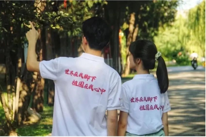
3 School of Foreign Languages
While the front is plain, with a PKU logo as a simple embellish, the back of the shirt is where the essence lies! The twelve-word message translates to "the world beneath my feet, the nation in my heart", implying that with the capability to converse fluently in various foreign languages, students are well-equipped to take on the world.
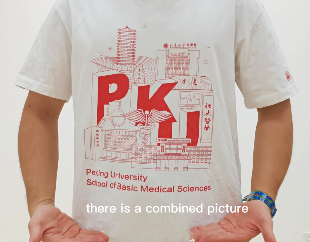
4 School of Basic Medical Sciences
The T-shirt of School of Basic Medical Sciences has quite an artistic design. On a white background, the shirt displays several landmarks of PKU as well as facilities that are often used by the students from the School of Basic Medical Sciences. On the left sleeve of the shirt, are the logos of PKU and the School of Basic Medical Sciences, printed in both English and Chinese. All of these illustrations are red as it represents the school colour.
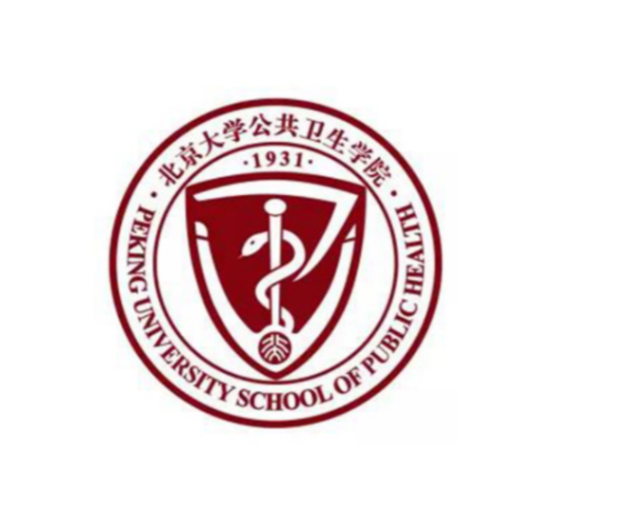
5 School of Public Health
The School of Public Health had designed a simple T-shirt for the 110th anniversary of the PKU Health Science Centre. Upon closer inspection, there is an abstractly written Chinese character "Wei" (卫), perfectly incorporated into the logo. This Chinese character can be translated as "protect" or "healt",hence the shield design, suggesting that the students will be dedicated to safeguarding people’s health.Making up part of the logo is also the staff with the snake, the symbol of medicine.
The eight Chinese characters printed at the back of the shirt, encapsulates the idea that students will spare no effort in serving the public and will be committed to promoting healthy living. How meaningful!
6 School of Electronics Engineering and Computer Science
The School of Electronics Engineering and Computer Science T-shirt has a black-and-white portrait of Hedy Lamarr on the front and a quote by her on the back, so as to pay tribute to her. Not only was she an actress, but away from the spotlight, she was also a dedicated scientist. During World War II, she developed frequency hopping, an ingenious way of switching between radio frequencies to reduce signal interference and avoid interceptions. This invention was a forerunner to today’s wireless communication technologies.
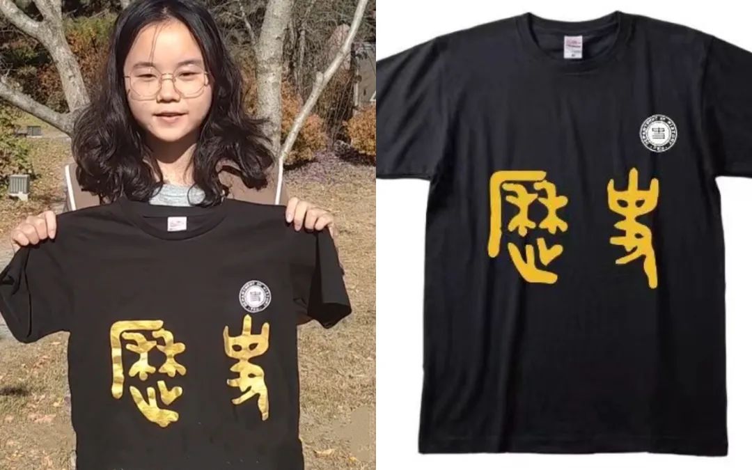
7 Department of History
This piece of clothing features an elegant combination of gold and black. The front has two Chinese characters "Li" and "Shi" (历史) printed on it. The two characters, which means history, is written in a form of Chinese calligraphy called bronze inscription.
On the back is a world map, with the word "history" written in different languages. If you were to take a closer look, you’ll realise that the position of each translated word corresponds to the location of theirrespective countries. This design symbolises the collective effort and wisdom of historians around the globe.
8 Department of Information Management
The Department of Information Management also has a simple yet meaningful design. The four pictures represent common data analysis techniques. However, if you look closer, the darkened areas of each picture form the Chinese character "Xin" (信), which means information. At the back of the shirt is the abbreviation "IMPKU" (Information Management of Peking University), traced in bright colours.
9 School of Mathematical Sciences
The above pictures show the front and back view of the shirt.
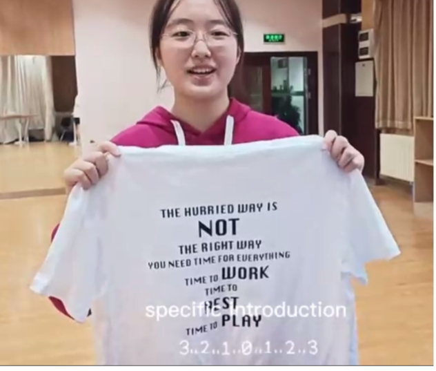
The School of Mathematical Sciences has come up with a hoodie in a really cute colour, pink! The slogan "Just Do Math" was inspired by the trademark of the shoe company Nike, "Just Do It". This slogan serves as a reminder for students to focus on their studies, and to "Keep Calm and Do Math"!
The pie chart shown on the shirt suggests that students should have a balanced school life between work and play, otherwise they might end up in the situation that’s illustrated on the back of the shirt—falling asleep when it’s time to study!
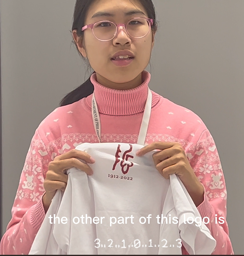
10 Department of Philosophy
The white shirt captures the idea of purity, and that students should always make space to wonder and contemplate deeper into philosophical questions.
The character above is written in a type of Chinese calligraphy called bronze inscription. The corresponding Chinese letter to this word is "Zhe" (哲), which refers to philosophy. The year 1912 writtenbelow refers to the year that the Department of Philosophy was founded. Simple, yet a perfect representation of the department!
PKU is where it is today, thanks to the cumulative contributions and work of every faculty. Almost all of the designs have the PKU logo integrated into them, something that represents the university despite being a department-based T-shirt. While some designs are thoughtful and complicated, others are simple yet artistic. Which shirt do you pick?
This video is the coursework of the English News Reading module taught by Associate Professor He Shu from the School of Journalism and Communication. A selected list of the works by PKU students will also be shared in the days to come, stay tuned for more!
Writted by: Guo Yanan
Edited by: Chan Zi Qing, Hu Shaocong
Cover Photo: PKU Guanghua School of Management
Designed by: Leong Chinro