Peking University, May. 16, 2015: You might not know that the current well-acknowledged school logo of Peking University is different from what it was 117 years ago, when Peking University was founded by the Qing Dynasty (1636-1912). The official version of PKU’s logo was not pinned down until 2007. In fact, the logo’s history epitomizes the history of Peking University.
Founded in 1898 by Emperor Guangxu, the Imperial Academy (the former name of PKU during the Qing Dynasty) did not have a formal school logo. The dynasty was overthrown in 1912, the Imperial Academy was renamed as “State Peking University”. It was not until 1917 that the first school emblem for PKU was created by the great writer Lu Xun.
At the request of the then PKU president Cai Yuanpei, Lu Xun designed the school logo for PKU which is still in use. This logo is composed of two ancient Chinese seal characters “Bei Da”, the abbreviation of Peking University in Chinese. What is interesting is that, the characters “Bei” and “Da” also looks like three simplified human figures, which bears the symbolic meaning that PKU is also the place for the cultivation of talents.
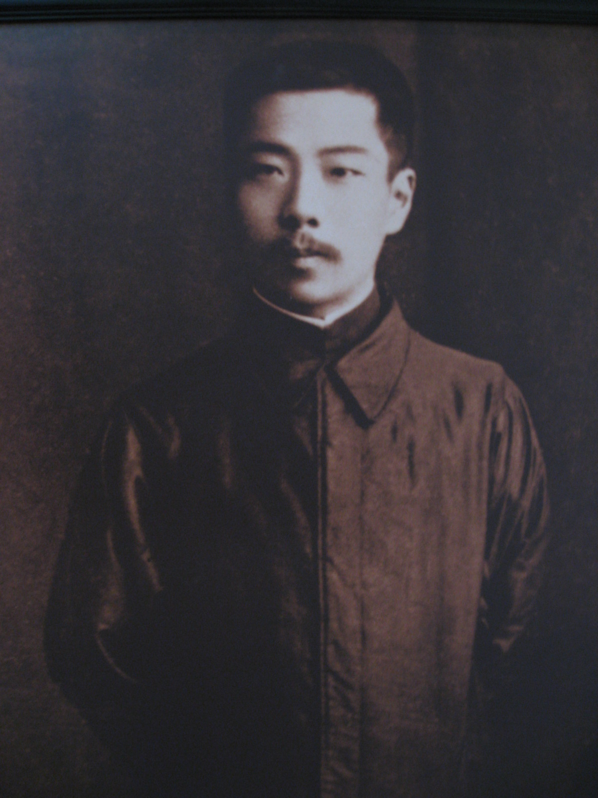 Lu Xun
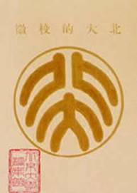
PKU Logo designed by Lu Xun
During the Second World War, another university logo was created. In 1937 when Japan invaded most of Northern China, Peking University was forced to move southwards to Changsha of Hunan Province, and then in 1938 westwards to Kunming of Yun’nan Province, where Peking University, Tsinghua University and Nankai University were merged to form the Southwest Associated University(SWAU). The new logo for SWAU was three triangles indicating the unity of these three universities.
 The Gate of SWAU
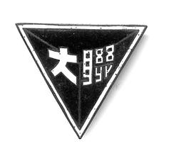
The logo of SWAU
In the 1980s, Lu’s version for PKU’s logo was readopted. Based on Lu’s original designs, some revisions were made. More details, English name and the founding year of PKU, were added and there are different versions of the logo in various colors. In 2007, PKU’s logo was finally standardized and red was made the official color of the logo.
Current official logo of PKU
Apart from the official logo, a special logo was also designed for the celebration of the centennial anniversary of PKU in 1998, which symbolizes congratulations on the centenary and best wishes to the future of PKU.
 Logo for PKU's centenary
Written by: Zhang Xinyu
Edited by: Xiao Chunliang
Source: PKU News